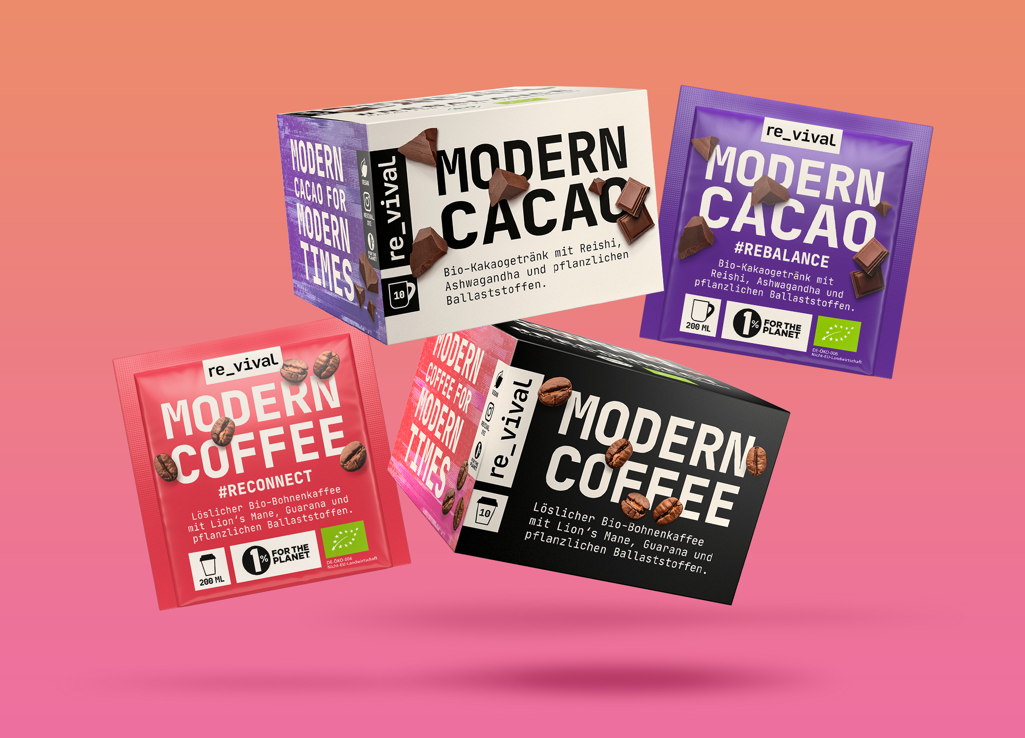
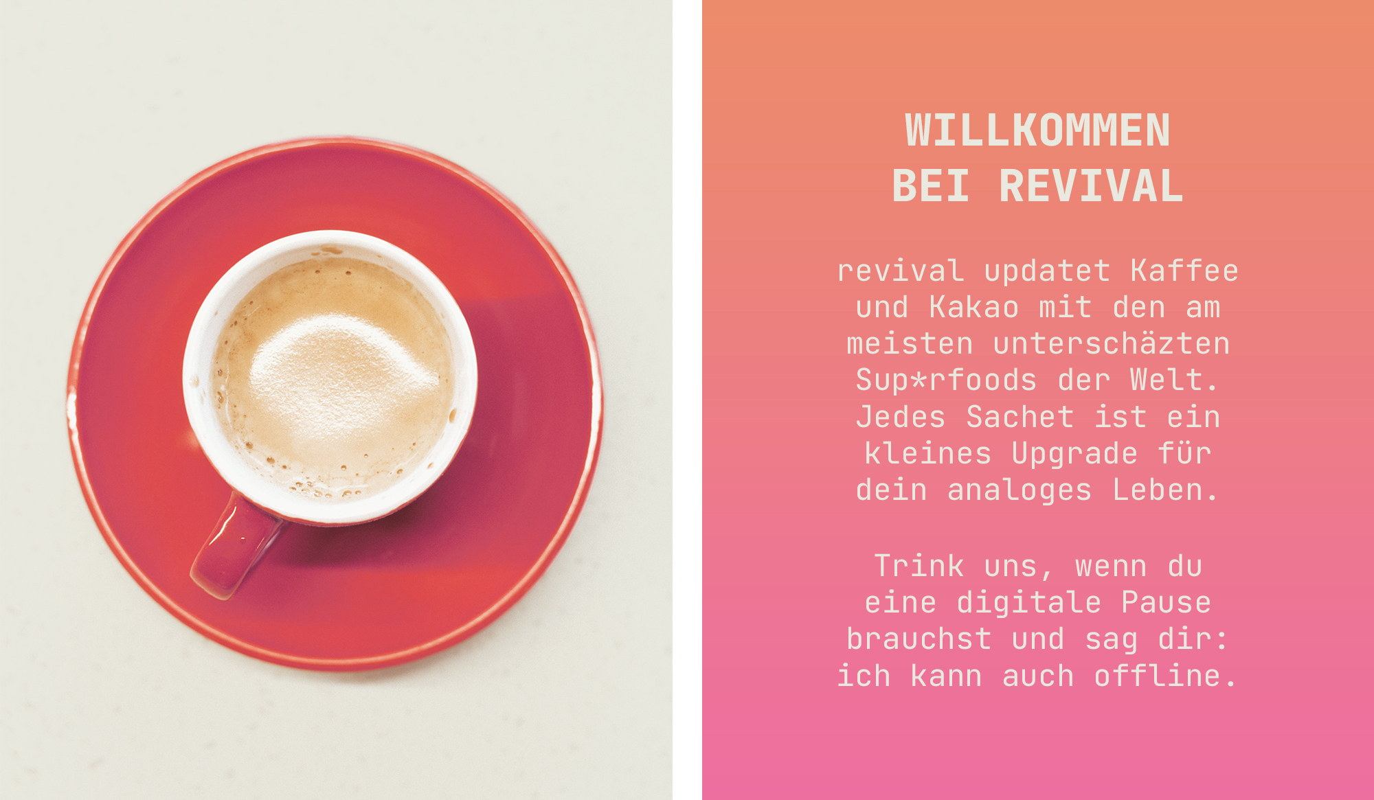
revival rejuvenates coffee and cocoa with the help of the world’s most underestimated superfood – mushrooms. Sounds weird, works well. Every sachet encourages you to take a break from the internet and get an upgrade on your analog life.
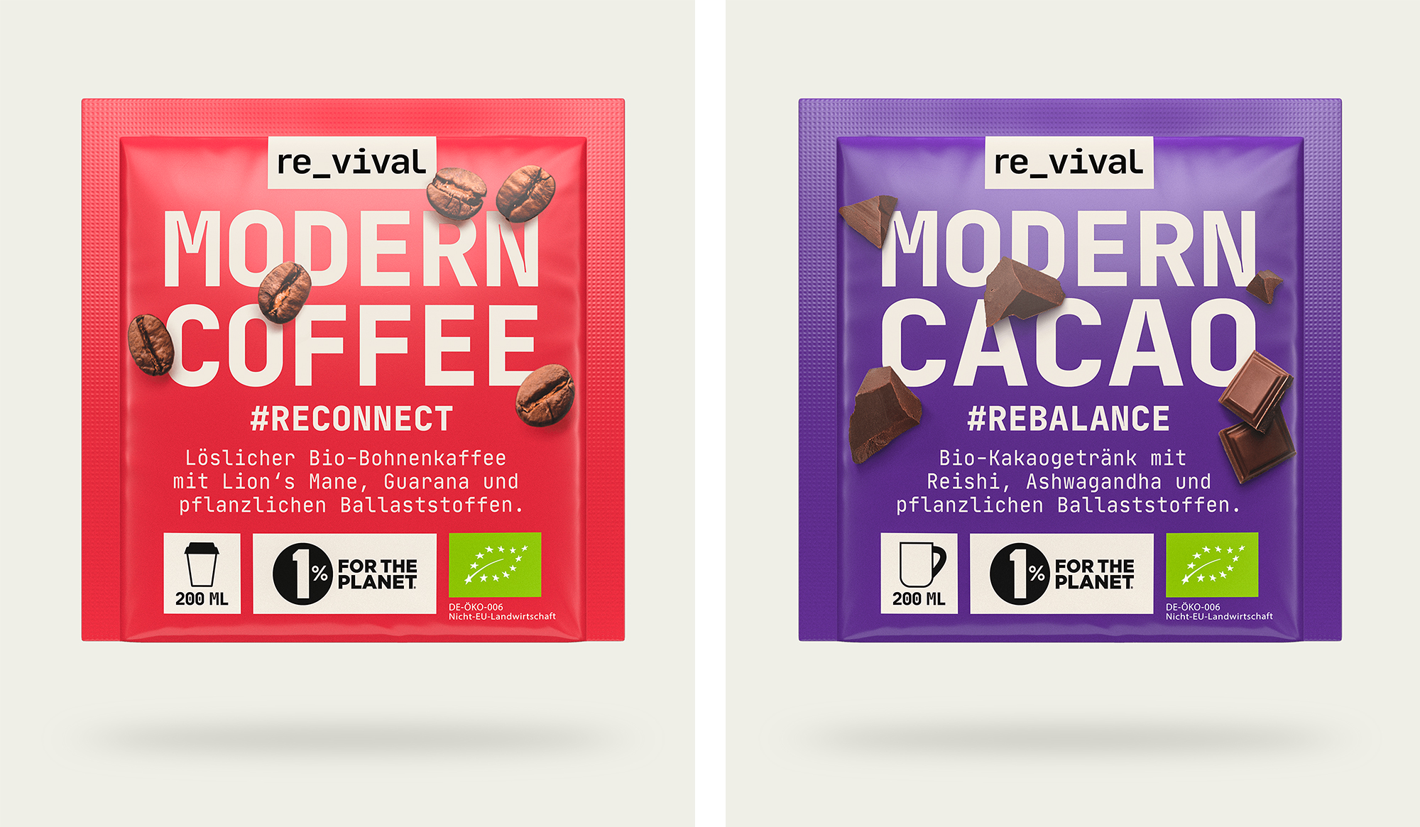
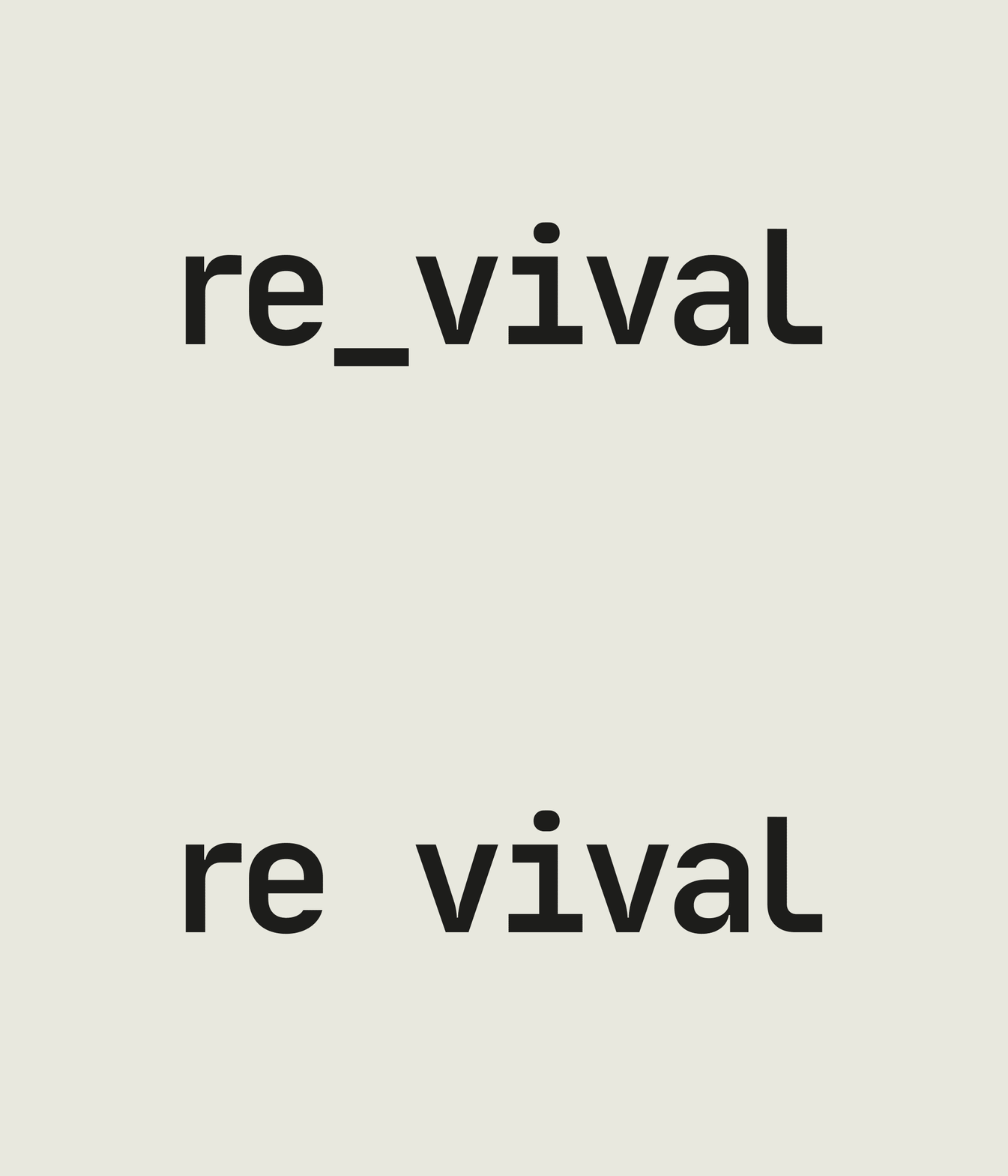
The brand plays with the aesthetics of the digital on a very analog product in many ways – always asking the question of why everything in our digital world constantly receives updates but the way we drink our coffee everyday does not. The logo incorporates the idea of building a bridge between these two worlds in the quite literal way of an underscore. In the digital version of the wordmark the underscore is animated and transports the feeling of a blinking cursor – the waiting, the in between the „what’s next?“. The Revival products are made for these exact moments: Have a modern coffee with less caffeine but more superfoods to reconnect with your ability to focus. All without the jitteriness of normal coffee. Or rebalance and rewind with a modern cacao with reishi and ashwagandha before going to bed, when ending your work day or whenever you need a break.
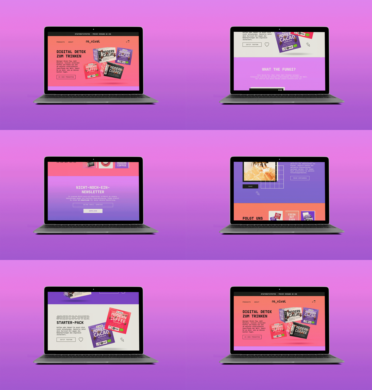
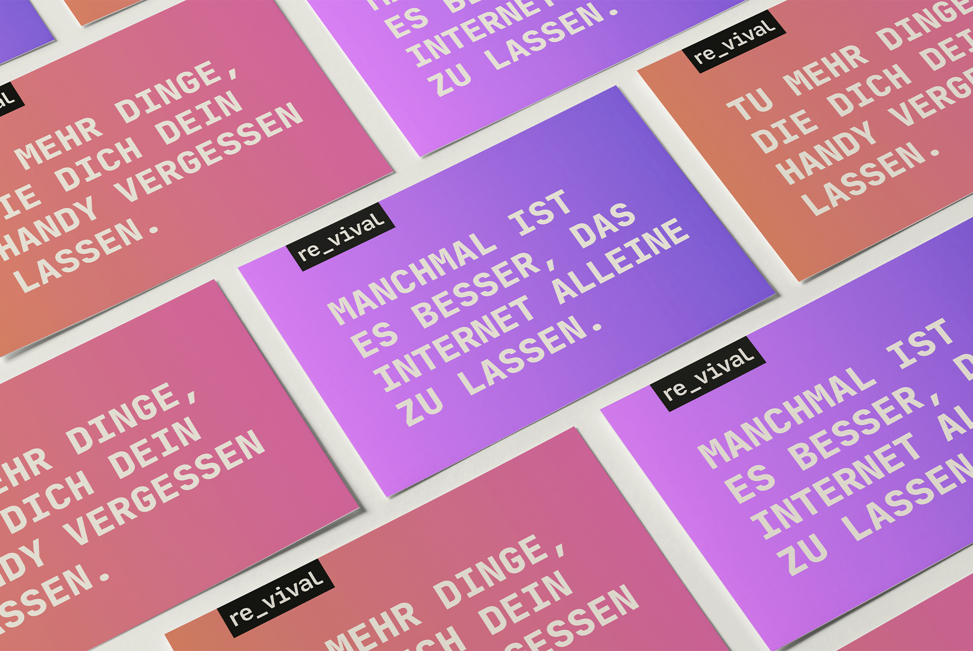
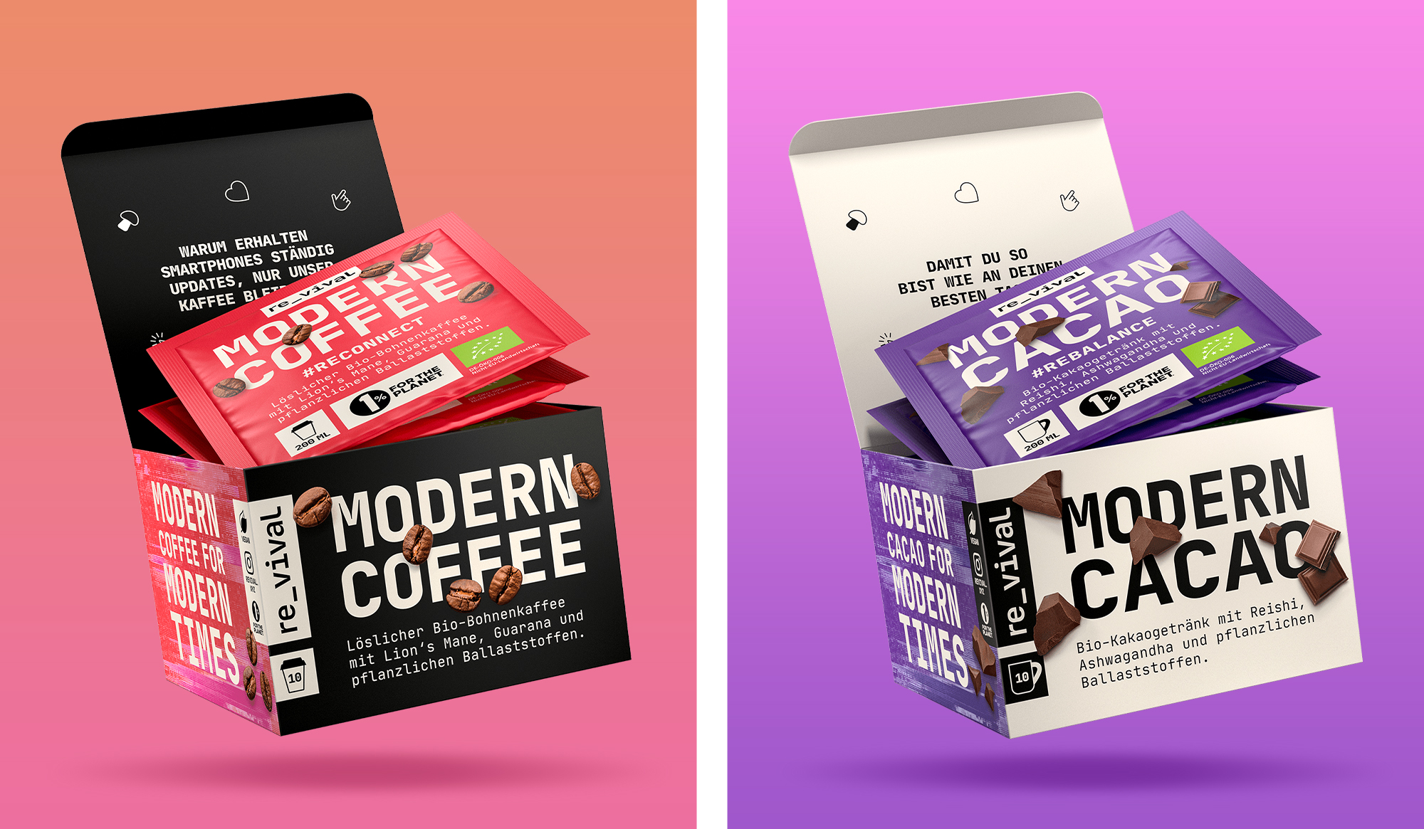
Vibrant gradients, glitchy textures and computer-linked graphics visualize Revival’s modern take on very traditional beverages. Floating 3d pack-shots convey the aura of something magically new and functional. And bold typography plays with rather traditional ingredient-photography to showcase that taste was not forgotten while looking at the high functionality of the products.
creative direction / branding / packaging design / website design